F&B Branding · Spatial Design
SONG CHEF – PYEONGTAEK GODEOK
송셰프 평택고덕
Godeok, Pyeongtaek, Gyeonggi-do, South Korea
경기 평택시 고덕
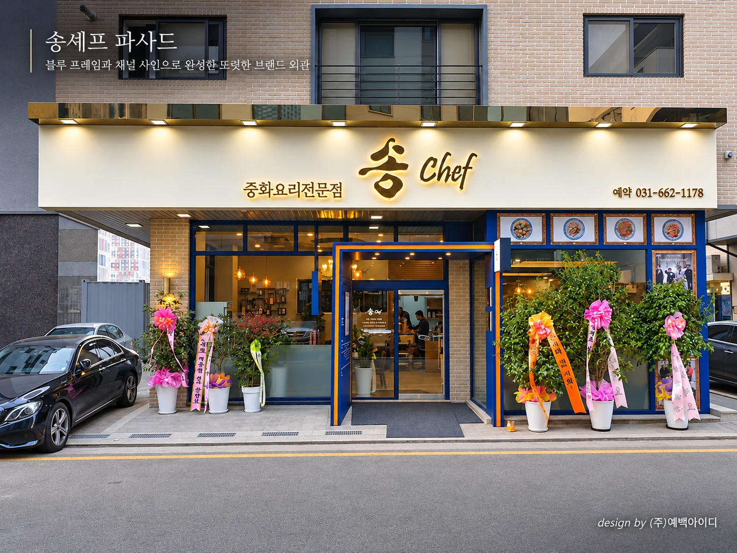
A contemporary Chinese dining space combining a bold blue entrance, elegant gold signage, warm wood textures, and intimate private dining rooms.
선명한 블루 프레임과 골드 사인으로 브랜드의 첫인상을 만들고, 따뜻한 우드와 부드러운 조명, 독립적인 다이닝 공간을 조화롭게 구성한 중화요리 전문점.
PROJECT OVERVIEW
SONG CHEF in Pyeongtaek Godeok brings together a distinctive brand identity and a refined Chinese dining experience.
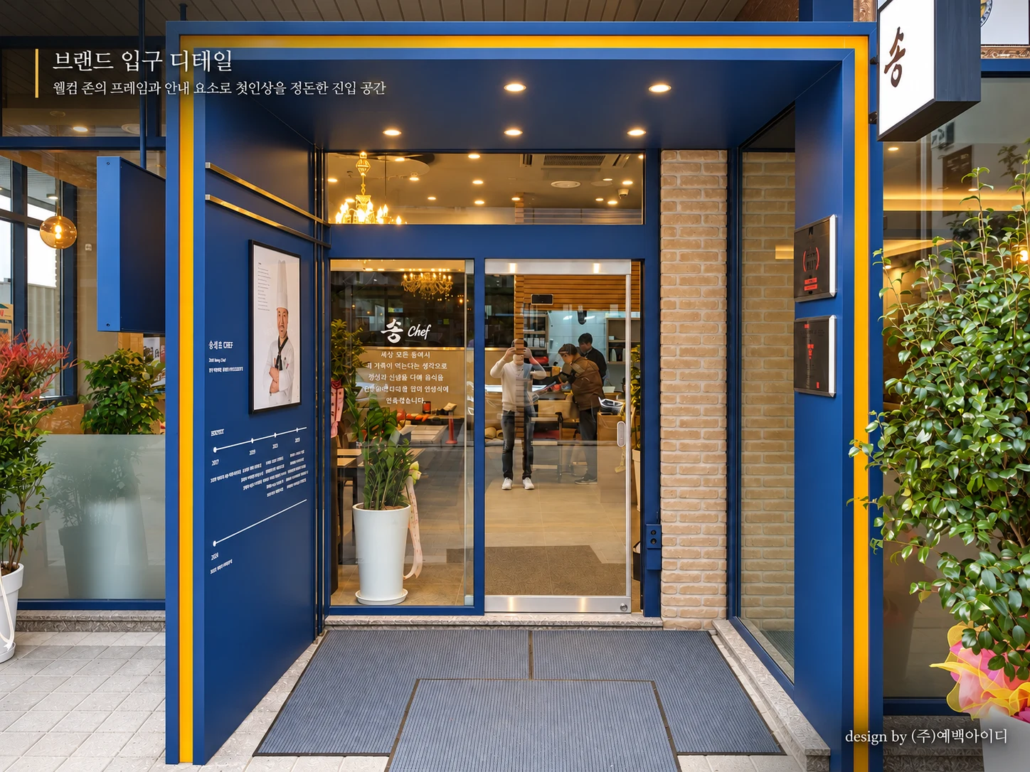
A bold blue entrance frame with subtle gold accents establishes a memorable first impression. Inside, warm wood finishes, neutral wall tones, and elegant pendant lighting create a welcoming contrast to the vibrant exterior.
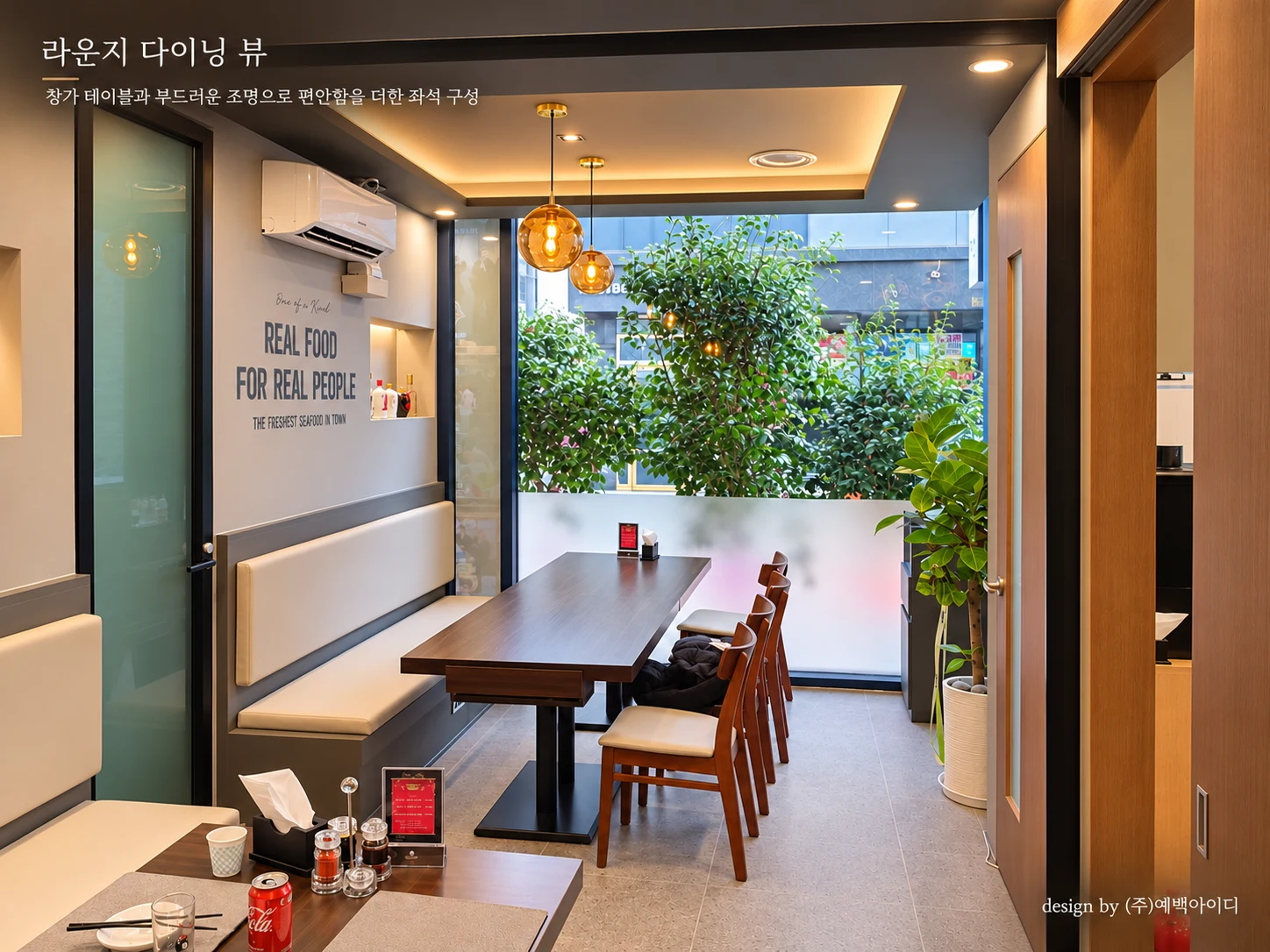
The dining space is organized into an open seating area and intimate private rooms, accommodating different dining occasions. Comfortable banquette seating, large windows, and carefully composed lighting contribute to a relaxed atmosphere.
By balancing contemporary architectural details with classic decorative elements, the project creates a cohesive restaurant environment that reflects both the identity of SONG CHEF and the comfort of its guests.
송셰프 평택고덕점은 중화요리 전문점의 정체성을 현대적인 공간 디자인으로 재해석한 F&B 프로젝트입니다.
선명한 블루 컬러와 골드 사인을 적용한 입구는 브랜드의 존재감을 강조하며, 내부는 따뜻한 우드 마감과 차분한 뉴트럴 컬러를 중심으로 편안한 다이닝 분위기를 조성했습니다.
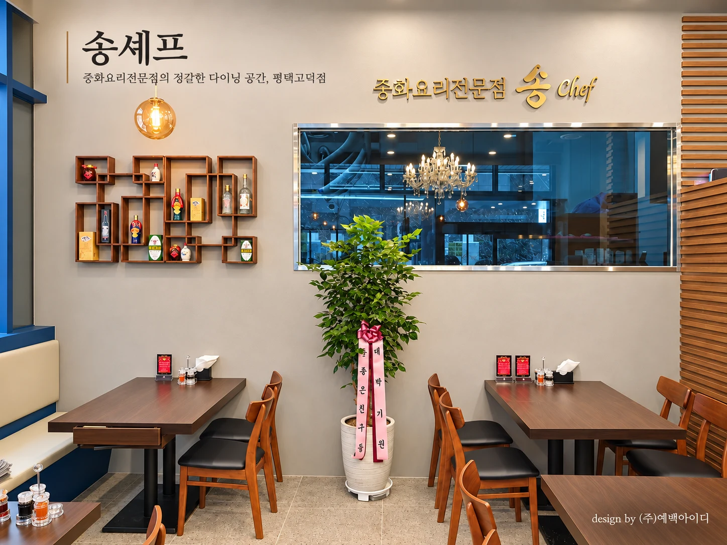
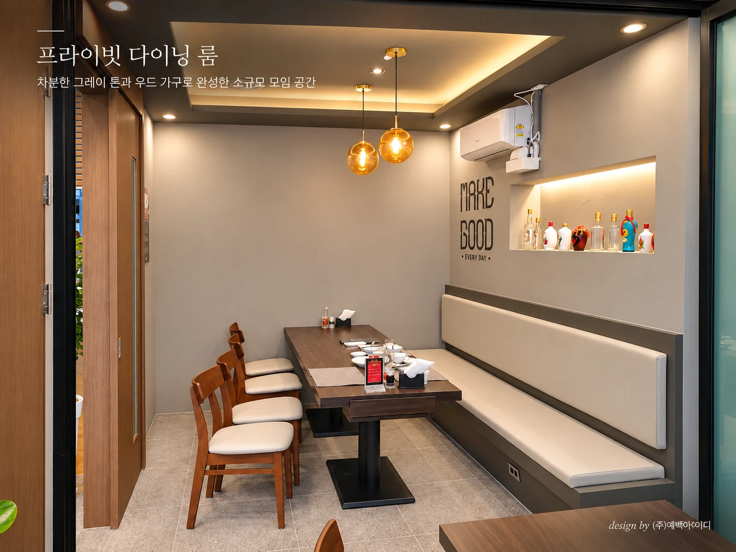
메인 다이닝 공간에는 브랜드 사인과 장식 선반, 클래식한 샹들리에를 배치해 공간의 개성을 표현하고, 프라이빗 룸에는 간접조명과 펜던트 조명, 부드러운 벤치 좌석을 적용해 독립적인 식사 경험을 제공하도록 구성했습니다.
외부의 강렬한 첫인상과 내부의 아늑한 분위기를 대비시키면서도 하나의 브랜드 경험으로 연결하는 데 중점을 둔 프로젝트입니다.
THE QUESTION
How can a Chinese restaurant establish a distinctive brand identity while providing a comfortable dining environment for both casual meals and private gatherings?
How can bold exterior branding and warm, intimate interior spaces be connected through a cohesive design language?
중화요리 전문점의 브랜드 정체성을 어떻게 공간의 첫인상으로 명확하게 전달할 수 있을까?
외부에서는 브랜드의 존재감을 강조하면서, 내부에서는 고객이 편안하게 식사할 수 있는 차분하고 세련된 분위기를 구현할 수 있을까?
또한 일반적인 식사 공간과 가족 모임, 소규모 회식 등을 위한 프라이빗 다이닝 공간을 어떻게 구분하고 연결할 것인가가 주요 기획 과제였습니다.
OUR FOCUS
The design strategy focuses on brand visibility, spatial comfort, and flexible dining experiences.
A bold blue entrance frame and gold signage create a recognizable visual identity. Warm wooden surfaces, neutral finishes, and carefully selected lighting soften the atmosphere inside.
The main dining area offers comfortable everyday seating, while separate private rooms provide a more intimate setting for family meals and small gatherings.
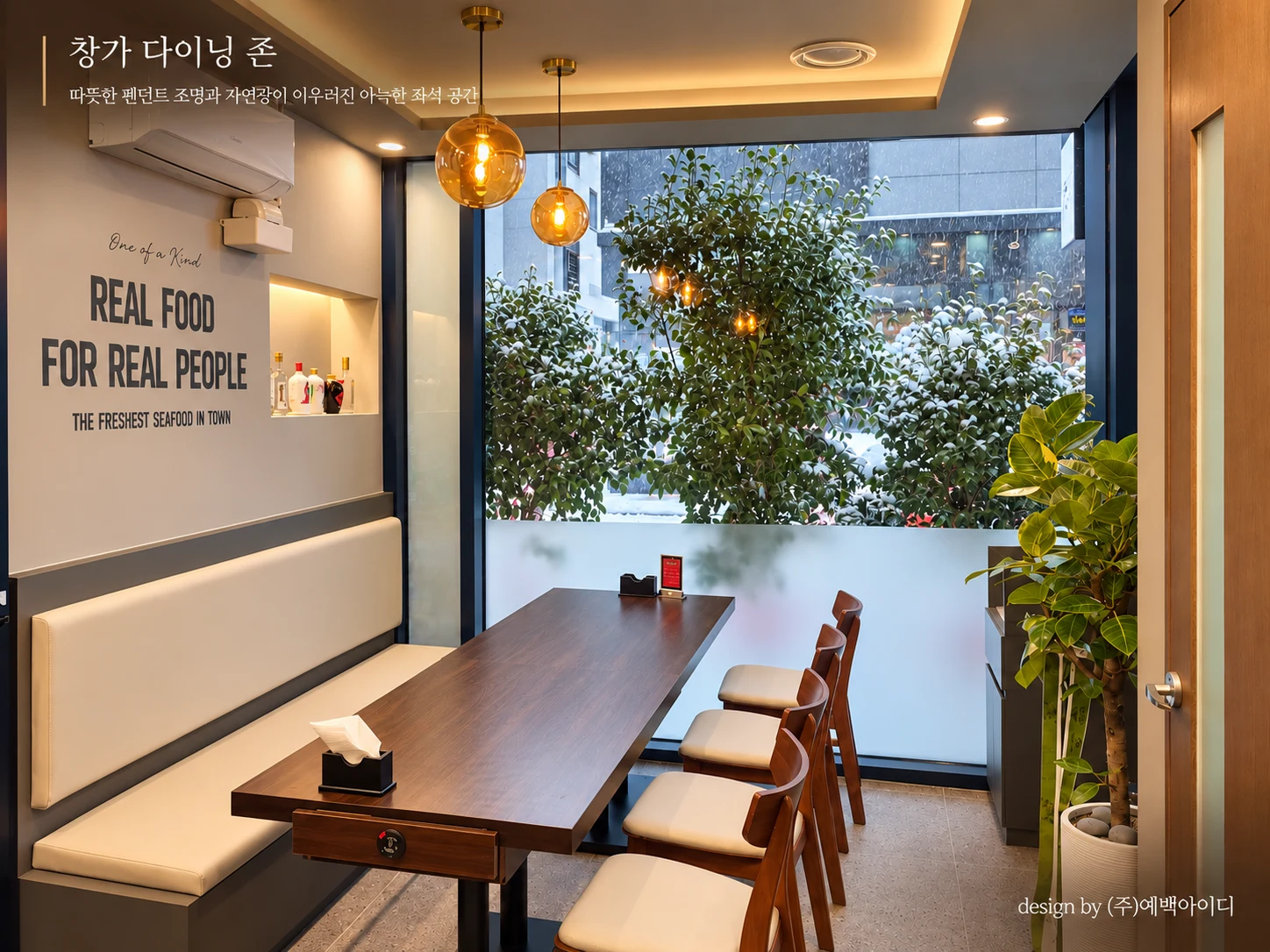
Glass partitions, upholstered banquettes, ambient lighting, and natural views add depth and comfort to the dining environment.
Together, these elements connect the restaurant's brand identity with a welcoming and functional spatial experience.
예백아이디는 브랜드 인지성, 공간의 분위기, 고객의 이용 목적에 따른 좌석 경험을 중심으로 디자인 방향을 설정했습니다.
첫째, 블루 컬러의 입체적인 출입구 프레임과 골드 사인을 통해 브랜드의 시각적 정체성을 강조했습니다. 외부에서 내부로 이어지는 진입 공간에 깊이감을 부여해 고객이 브랜드를 경험하는 첫 장면을 만들었습니다.
둘째, 메인 다이닝 공간에는 우드 가구와 밝은 벽면, 장식 선반 및 클래식한 조명을 조합했습니다. 현대적인 마감 위에 중화요리 전문점의 분위기를 느낄 수 있는 장식적 요소를 더해 공간의 개성을 표현했습니다.
셋째, 프라이빗 룸은 차분한 그레이 톤과 우드 가구, 아이보리색 벤치 좌석으로 구성했습니다. 천장 간접조명과 따뜻한 펜던트 조명을 활용해 독립적인 식사와 소규모 모임에 어울리는 아늑한 환경을 조성했습니다.
넷째, 창가 공간에는 넓은 유리창을 통해 외부의 자연 요소를 실내로 끌어들이고, 좌석 구성을 간결하게 정리해 개방감과 편안함을 함께 확보하고자 했습니다.
이를 통해 송셰프의 브랜드 이미지와 다양한 고객의 식사 목적을 공간적으로 연결한 중화요리 전문점을 구현했습니다.